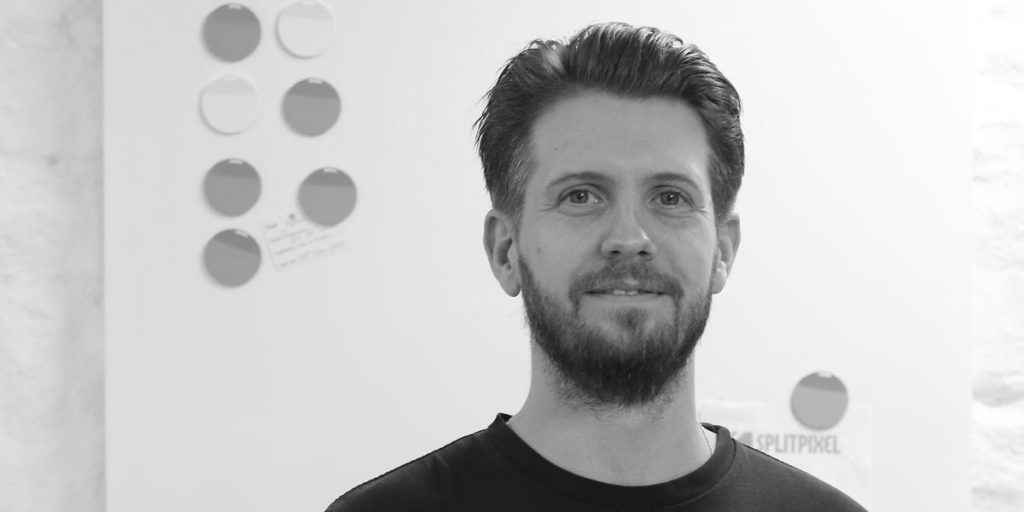
Our lead designer, flat cap-wearer and harmonica-player talks about his design processes.
Next up in our Q+A series is our experienced designer, Mr Rob Marshall. When we say experienced, we mean he’s been mucking about in Photoshop in a professional sense for well over a decade.
Specialising in working with clients to develop their brands, and condensing their personality into nice-looking designs, Rob is responsible for being the person who makes you say, “yeah, that looks great”.
Turning up at the Splitpixel offices back in 2011, all bright-eyed and full of design dreams, Rob has added his own brand of quirkiness to the office, serenading us with his harmonica and never-ending stream of flat caps. Oh, and his designs seem to go down really well with clients too – so that helps.
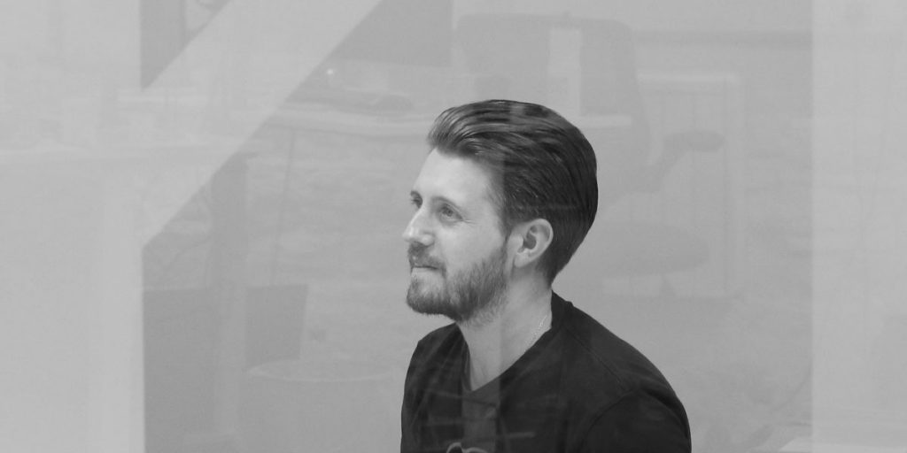
We took some time out to talk about design, user experiences and interfaces, and all sorts of other bits.
Hi Rob! So, what attracted you to graphic design?
My mum, really. It wasn’t always the path I decided to go down, but once I decided I wanted to do design, I suddenly found that I was inspired but I didn’t know it. My mum studied art at college but went on to become a teacher, and she designed my primary school logo – which I only found out when I was part way through school. She explained to me the hidden meaning behind it all and the little intricacies which I hadn’t appreciated it before, so it certainly inspired me.
I fell out of love with studying so when I finished my A-levels, I went to be a mechanical engineer for a year which was enjoyable, but I realised it wasn’t what I wanted to do. So, I went back to college and got a degree in creative multimedia and I set up a short-lived agency, then moved on to become an exhibition designer but it was creating the wall graphics that I really enjoyed.
Then I worked at a software company for a number of years in Leeds and then came back to Sheffield and worked in email marketing for a year, and then eventually found my way here – where I still am six years later. So, all in all, I’ve worked in design for 16 years now.
What does a typical day look like for you?
I’m up at 6:30 every morning for a dog walk, get back, have a brew and then drive to work from Sheffield which takes me about 45 minutes – which is good because it gives me time to come round.
A good day for me is headphones on, focused on one project. But because we work with a lot of clients, it’s not very often that happens, so it’s interesting to jump across from project to project and work with different brands. New projects are exciting, starting from scratch and planning it out, getting some sketches down and putting it all together – it’s great to see your ideas come alive when they’re in a physical form.
I can’t say that I really have a typical day to be honest, every day is different when it comes to working with clients and it’s good to see something new arise and challenge what you’re doing – it helps keep you on your toes.
We’ve recently been talking about the importance of user experience and user interface… How important is that for you when starting a new design project?
UX and UI were terms that became buzzwordy a few years ago, and quite rightly because they’re massively important to focus on the user when designing. But the user for whatever you design is always the focal point in the mind of any designer worth their salt – the user has to have a good experience and that should be natural.
As far as I’m concerned, they’re synonymous with each other. Design, as a discipline, is planning for construction – it’s the planning stage before the construction. Good design, really, is figuring the best path from a user’s problem to a user’s solution, and I think the user’s journey on anything such as a website is exactly that. User experience and user interface, to me, are crucial to any website development.
The whole aesthetic side of the design as opposed to the layout of the website and the build, that’s really a case of trying to get across a brand’s ethos in a visual way. You wouldn’t use an over the top scripty font for a professional business that specialises in a technical industry, and if you choose the wrong font or choose the wrong images on a website then that confuses the message – and interrupts the user’s journey.
Do you think UX is a set formula or should we be open to new innovations? Apple’s iPhone X has been criticised by some as a UX nightmare.
UX, to me, isn’t a set formula. There’s no stage one, two or three – it’s really just trying to stick to a set of principles when working on anything. Apple have always been really good at that in the past, very good at innovating and resetting the standard.
I remember Apple’s strapline for their computers being “it just works” and that was at the centre of everything they did. They didn’t want things to be complicated and wanted to simplify things for users, and they’ve achieved that time and time again.
I think in a way, their problems are natural. You set a convention, and they then have to fix legacy issues to try to cover all ground, but when you’ve got a massive user base you’re going to upset some people. The vast majority will get onboard with new changes, embrace it and move on.
When people talk about the cutting edge of technology and innovation, I think you have to push something to breaking point and it’s when you break something and have to start again that you really innovate – you stop doing something one way and do it another.
How has web design changed over the years, in your opinion?
There’s always milestones but just in general, the whole world of web design is maturing. Its best practices are rising to the top and the old way of doing things is practically dead and buried now, and I’m only talking about how we created websites three or four years ago!
The evolution of various devices with which people can access the internet now has created a necessity for huge change. You can no longer design one static layout for a website and build it, it’s brought a big change and it shifted the way we need to design things.
The big one for me is, since responsive design is the norm now, the design stage from a static layout into something that responds while you’re designing it. So, browser-based design tools became a massive part of it, and they’ve really matured. WYSIWYG (what you see is what you get) editors, the vast majority are still awful to work with from a development perspective but are useful for a design purpose.
There used to be a big chasm between producing web design and the development of the website, but bridges have been built and some tools for design produce decent code for developers to work with, which wasn’t always the case.
How is web design changing now, in your opinion?
How’s design changing? Well an example is that designers are getting used to introducing interactions on websites, little animations for example are now in the hands of the designers and not just the developers, so we can really push the boundaries more.
Working this way was a big change and difficult from a logistical perspective, as was finding the time to get to grips with new tools and find an understanding client that stuck with us through the transition. But, we found one and managed to develop a new and improved workflow between design and development. It might seem small, but the little touches make a big difference to websites now, and they can be far more interactive as a result.
Little animations in websites used to be frivolous but now they’re in the hands of the designers who you hope are putting the users first. These little changes are more to make the users comfortable rather than wow them. Again, it might seem small, but they polish the site more and make people confident in the product that they’re using. They’re adding value if used properly, rather than just being pretty.
How do you come up with concepts for your projects and what’s your process for developing ideas?
In general, every website is a different animal, but the best way of approaching it is by starting with their brand. If I try and immerse myself in their brand, try and learn as much about the people who run the company and the audience they’re trying to appeal to, and the products and services they sell – then it’s about the best way to communicate their tone of voice visually.
It’s important to meet the people behind the company and take it from there. We’ve never built from templates with web design, it’s always done bespoke to those customers which takes a little more time – but is ultimately more rewarding as a result. If a business is serious about its brand and serious about trying to communicate its message, then it’s crucial that it has a tailored solution to suit their needs and their users.
What’s the biggest risk you’ve taken in design, and what did you learn from it?
I think it was making the jump from flat design, so your static mock ups to physical working concepts. I had a background of building websites in the past, but my knowledge was massively outdated, so it’s been revived and expanded on, so I can know what is and isn’t possible in code.
Making the jump back into designing in-browser, physically building something that I can pass on to the development team, and have a grown-up conversation with them about, is massively important. I’d say it’s my biggest learning curve since leaving college.
What question do you think clients should ask when they want an agency to design a website?
A couple of things on this. Finding a good fit is crucial but first and foremost, can you come and see us? We didn’t always do that in the early days and trying to implement someone’s vision without that face-to-face contact can be difficult, but achievable.
It’s really important for a designer to be in front of the client at the earliest possible stage. If the client doesn’t have time to see you, then the results aren’t going to be as good as they potentially could have been.
Secondly, I’d say if there’s a specific problem a client has, the question I would ask to an agency is how can you fix it? You need a challenge in order to come up with a design that’s worth anything and overcome an issue they already have.
Whether that’s an old website that’s outdated, or it’s not conveying their brand as well as it could, or simply not converting enough leads. When they’re interested in your approach to solving the problem, advising and listening to the expertise of the agency in the web environment and working collaboratively, then it gets good results.
Clients understand their business, and agencies understand digital, so the two combined can create great results if they’re working together. I think to get the best out of agency, you have to allow them to understand your brand and objectives, as well as listening to their ideas for achieving what you want in a digital space.
Finally, it’s been a popular 2017 hashtag – can you #badlyexplainyourjob?
I try to come up with infinite ways to make text, images and colour look different every time.
Continue reading...

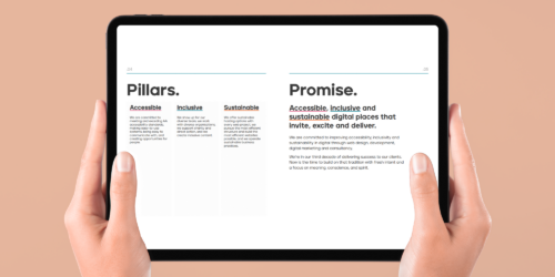
Improving your brand’s accessibility
Accessibility is at the heart of everything we do. As one of our core values, we make it a priority when designing websites and branding.
Written by Lily Houston
Sign up to our newsletter
Lets work together
Contact us