Yes, it’s another digital marketing acronym (DMA), this time for call-to-action – something that makes you do another thing on a website.
A CTA, as the name “call-to-action” would suggest, is a means of encouraging the audience to participate in something or take some form of action. CTAs usually take the form of an image, button or line of text.
CTAs are essentially signposts that help guide a user through the buyer’s journey, from enabling them to do research and gather information (the awareness stage), to assisting them in making an informed decision to purchase/sign up/register/etc. (the decision stage).
The first time they visit your website they may know very little about your company and be unaware of the services you offer, but the fact that they are there means they are already curious about you. And you should capitalise on this by making it very easy for them to perform the actions you would like them to take. CTAs can be used for a whole range of activities, such as signing up to newsletters, adding products to a shopping cart or engaging with social media.
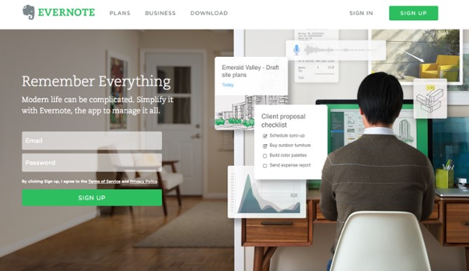
This example shows an example of a sign up CTA used on Evernote’s homepage:
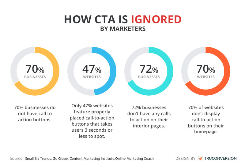
All too often though, businesses neglect to consider the impact of the CTA on their digital marketing collateral and investments made to generate online visitors to a website are in vain. Given that 93% of businesses rely on lead generation from their websites, it’s a surprise that 87% of SME websites don’t even promote the most basic of CTA – the “Contact Us” – on all pages (according to a recent survey)
These small, seemingly insignificant graphical pointers can have a significant impact on conversion rates. Without any CTAs, a potential lead is likely to simply skim over your content and then leave again – perhaps even frustrated with the experience.
What makes an effective CTA?
It’s easy to create some banners and add them to your website or integrate into your e-shots, but how can you ensure that they are actually going to do the job? Here are some essential tips for creating the best CTAs.
Design
Design is important, although it is not the place to go wild with creativity. Generally speaking, a CTA is some form of button or link, and sticking with recognisable web conventions is the best way to keep your visitor on track.
In relation to colour, it is debatable whether certain colours are more effective than others (and certainly difficult to prove!), and what works for one website may not work for another.
The main thing to remember is that your CTA needs to stand out, so choose a colour which contrasts with the other colours on your page, while still keeping in line with your brand.
Use the same colour and style for CTAs across your website so the user associates this with taking some sort of action, but pay attention to hierarchy. You may have buttons which perform a less important action and these should have a slightly lower impact than your CTA buttons.
Give your CTAs plenty of space and position them logically in the natural flow of how a user would read through the page. For example, you might put a CTA to download an e-book at the end of a related blog post, just as the reader is wanting to know more.
Copy
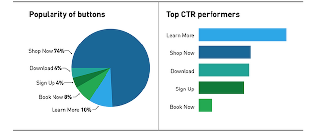
The text you use on your CTAs is also incredibly important. You need to consider those actionable verbs that will get people’s attention. “Download” and “Submit” alone are probably not enough. If you take Facebook, for example, the most effective CTA for sponsored ads in terms of most clicked was actually “Learn More”.
Remember that you are trying to influence the user to take an action. You might want to amend your tone of voice to be more conversational or include the benefits to the user (e.g. “Try now for free!” as opposed to “Sign up”). Using phrases such as “now” also helps to create a sense of urgency, encouraging the user to click sooner.
Make sure your CTA meets expectation
Again, it’s worth considering what stage of the buyer’s journey your user is at when they arrive at your site. It would be presumptuous to expect the user to convert straight away, so the use of copy should be sympathetic to their needs.
According to Pardot’s State of Demand Generation report, 70% of buyers return to Google at least two or three times during the course of their research, diving even deeper into each company’s specific offerings to see how they can address their particular pain points.
So, for example, the CTAs within your awareness content might link to a simple newsletter sign up or download of a white paper that will help to assist with your users’ research.
Ultimately, it’s important that wherever you choose to direct your users, they feel comfortable with where they land, and find what they expected to find.
Landing pages
CTAs to contact pages and enquiry forms are CTA 101, but those who are really considering the buyers’ journey and are looking to really nurture the relationship with their users (because it’s the nurtured leads that are 20% more likely to convert into sales opportunities), dedicated landing pages can be significantly more effective.
It offers up the opportunity to elaborate on your offering, encourage your user to pass over the all-important contact details, which is basically an approval to contact them, and enrol them in the workflow that starts to introduce your company and services.
What should your CTAs look like?
CTAs can appear in a number of formats, although (as you will see) they generally all follow the principles referred to above.
Here are a few examples:
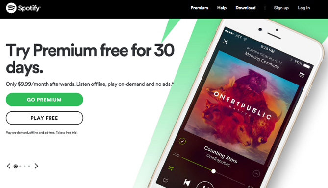
Spotify
Balances a primary and a secondary CTA, making it clear that the emphasis is on users signing up to the premium version.
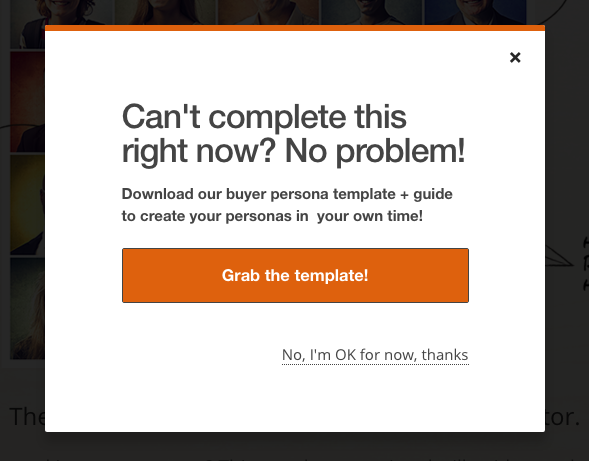
MakeMyPersona
Another CTA with a secondary option, although this has a much higher contrast between the two, making it very clear what the preferred action is (but, importantly, giving the user a chance to opt out of the transaction).
Huemor
This CTA uses a very playful approach with wording, being accompanied by the phrase ‘Do Not Press’. Which, of course, instantly makes you want to press it.

OfficeVibe
This CTA to subscribe to a blog slides into view as you are close to the end of the blog you are reading, with text relating to the blog in question.

Are you using CTAs on your website? How well are they working for you and indeed, are you monitoring their effectiveness? Ultimately, do you think there is scope for further lead generation from your digital marketing?
If you would like to chat about website planning for lead generation or simply have a question for our team about this article, don’t hesitate to contact us!


Continue reading...

The six best tools for competitor research and analysis
Understanding what others are up to is essential for developing a marketing plan. Here are some of the tools we use that are much better than peering through windows.
Written by Carlos Pinheiro

Improving your brand’s accessibility
Accessibility is at the heart of everything we do. As one of our core values, we make it a priority when designing websites and branding.
Written by Lily Houston
Sign up to our newsletter
Lets work together
Contact us